Coffee Packaging Design
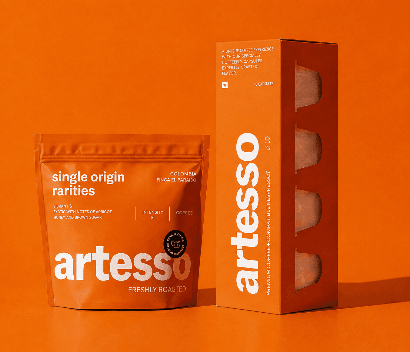
A vibrant, modular packaging system designed for a specialty coffee brand, using bold color-coding and strong typography to distinguish each roast profile while maintaining a cohesive brand identity.
Company
Artesso
Year
2026
Time Line
10hr
Preview
Project Over View
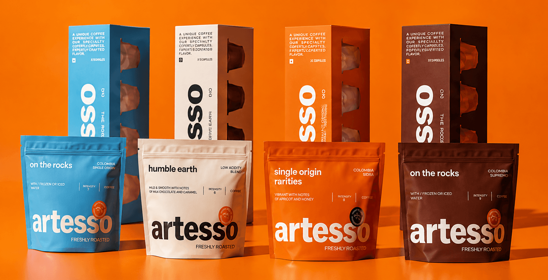
Artesso needed a packaging system that could scale across their growing range of coffee blends without losing brand consistency. We developed a bold, color-driven identity — pairing a striking wordmark with a distinct color for each variant across both pouch and box formats. The result is a flexible system that's easy to scale as new products launch, while staying instantly recognizable as Artesso.
Challange
The client offered multiple coffee variants but lacked a clear visual system to help customers quickly differentiate roast types on shelf, resulting in a disjointed brand presence.


Clicent Says
"The new packaging finally tells our story at a glance. Each roast has its own identity, but together they feel like one strong brand." — Elena Martins, Founder
Result
The new color-coded system improved shelf differentiation and made the product line instantly recognizable, contributing to a noticeable increase in repeat purchases across variants.